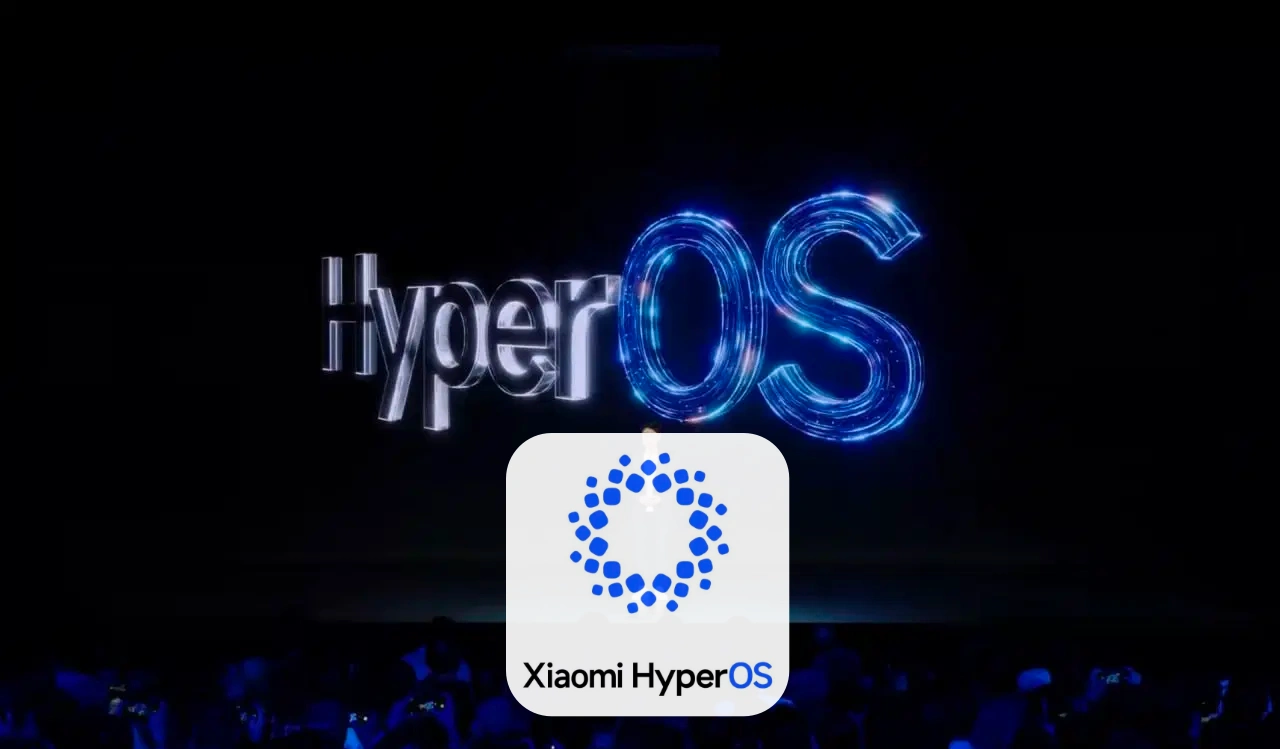
In a recently revealed official post, Xaiomi’s new logo has been designed for HyperOS in front of spectators who believe that this will be the beginning of a new era for them.
The Android-based MIUI, which has been present in the company’s smartphones and tablets for a long time, will now be replaced by Hyper OS. This move by the company aims to create its own ecosystem by including it in eclectic vehicles as well. Xiaomi is preparing to launch its first HyperOS-based electric vehicle; in the meantime it has unveiled a logo as follows-

The new logo appears to have been designed minimalistically. This square, circular, star-shaped symbol can be seen as proof of Xiaomi’s unwavering dedication and modernity. This shape probably symbolizes the ecosystem and was designed to emphasize comprehensiveness; when compared to the previous MIUI logo, it can be said that it is a step forward from the previous logo.
As you know, the company used to use logos made of letters instead of design, but now it is moving on to new things for cutting-edge technology and intuitive user experience.
Xiaomi is constantly pushing the boundaries of innovation, as evidenced by this revised logo, which is setting an excellent platform for the future where technology will be seen as an integral part of our daily lives.
Their aim is to deliver more than just products and provide a holistic interconnection between technology ecosystems. The new HyperOS logo invites us to embrace a world where devices collaborate seamlessly and whose possibilities are limitless.
Also Read | Xiaomi Unveils Striking ‘Aqua Blue’ Variant Of SU7 Ahead Of EV Technology Launch


